
An app for issuing and managing virtual cards
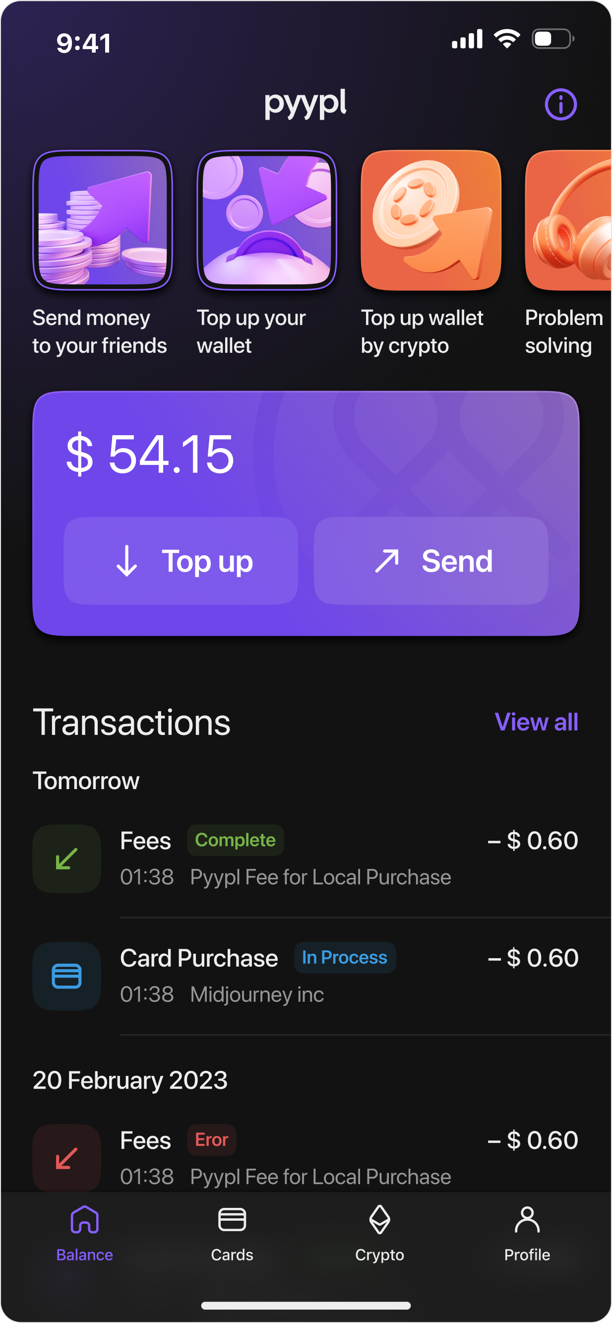
Redesign concept: developed the app design, design system, light and dark themes, flag icons, and 3D illustrations.

User flow
Developed the core user flow, created a clickable prototype, and designed transition animations.
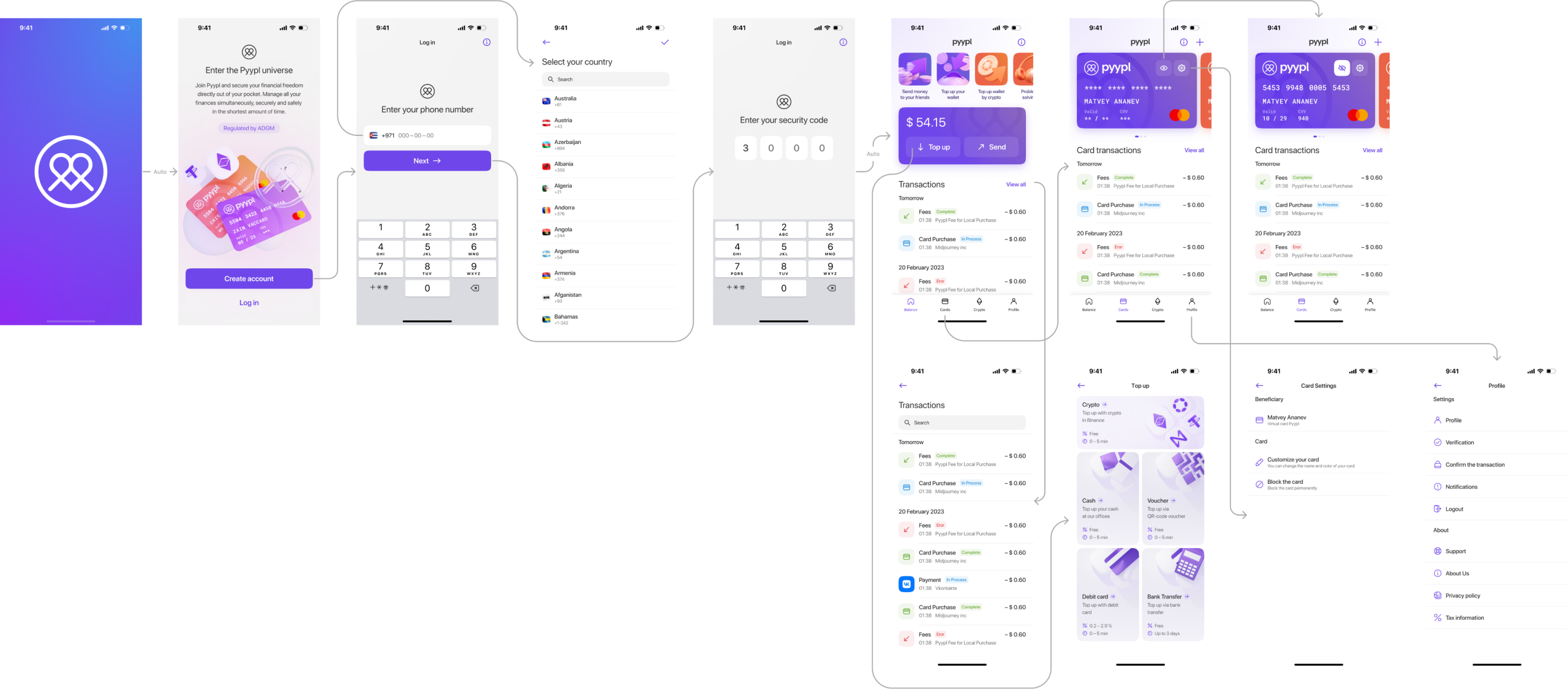
Start screen
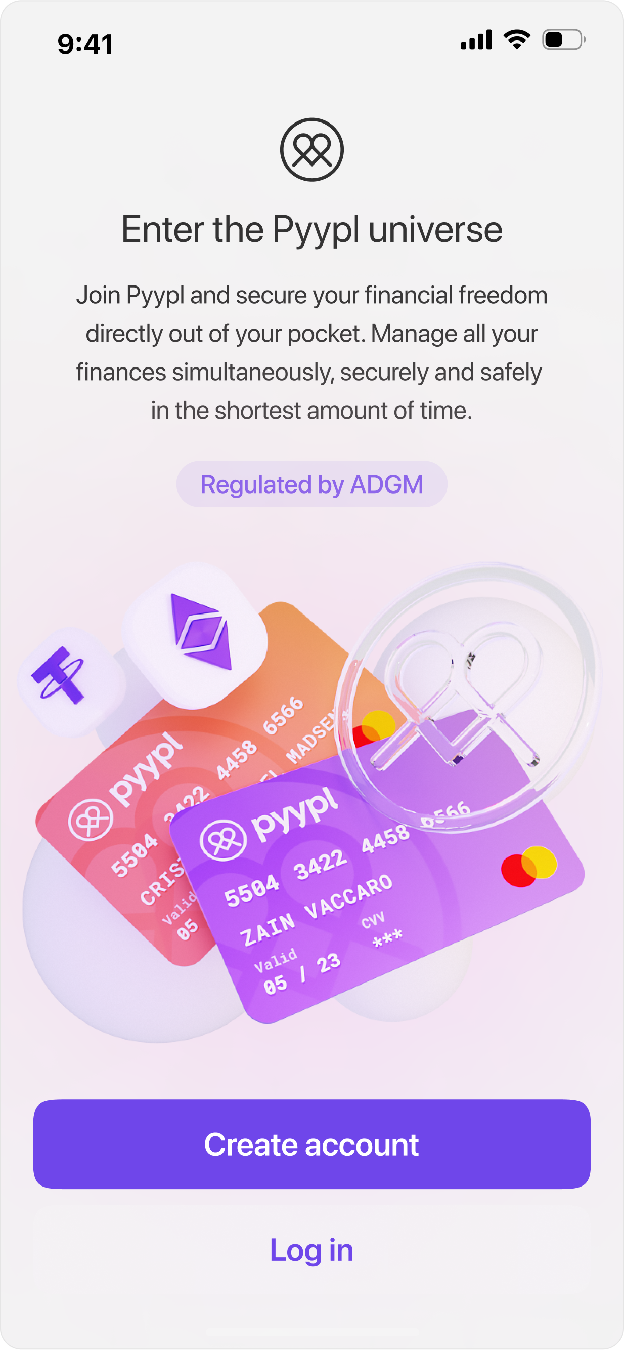
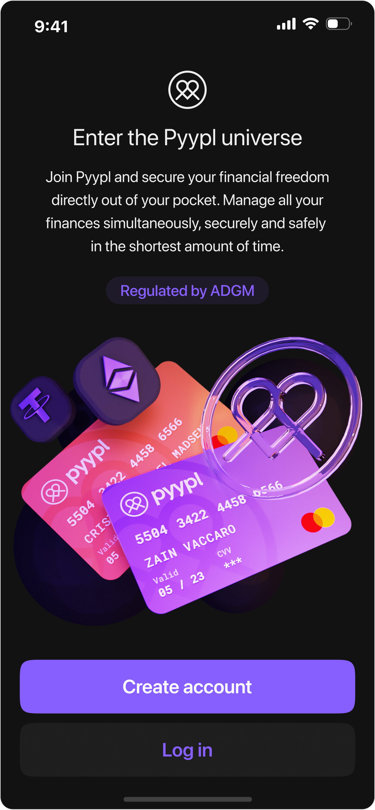
We explain to the user why they need to create an account and offer options to log in or register. The illustration, created in Blender specifically for the app design, comes in two versions: one for the dark theme and one for the light theme.
Registration flow
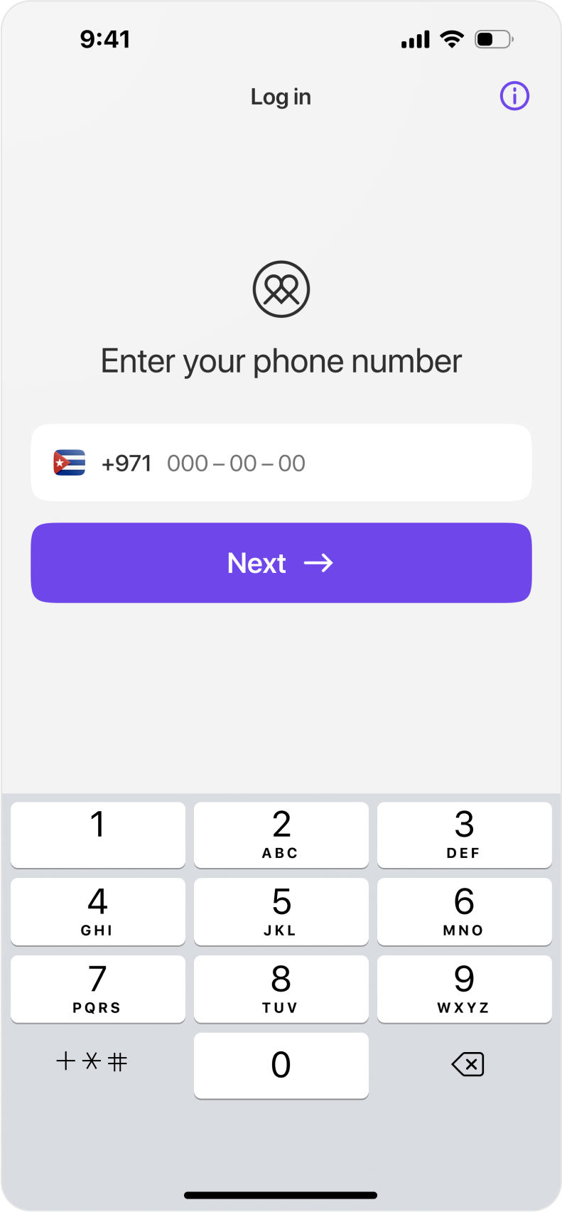
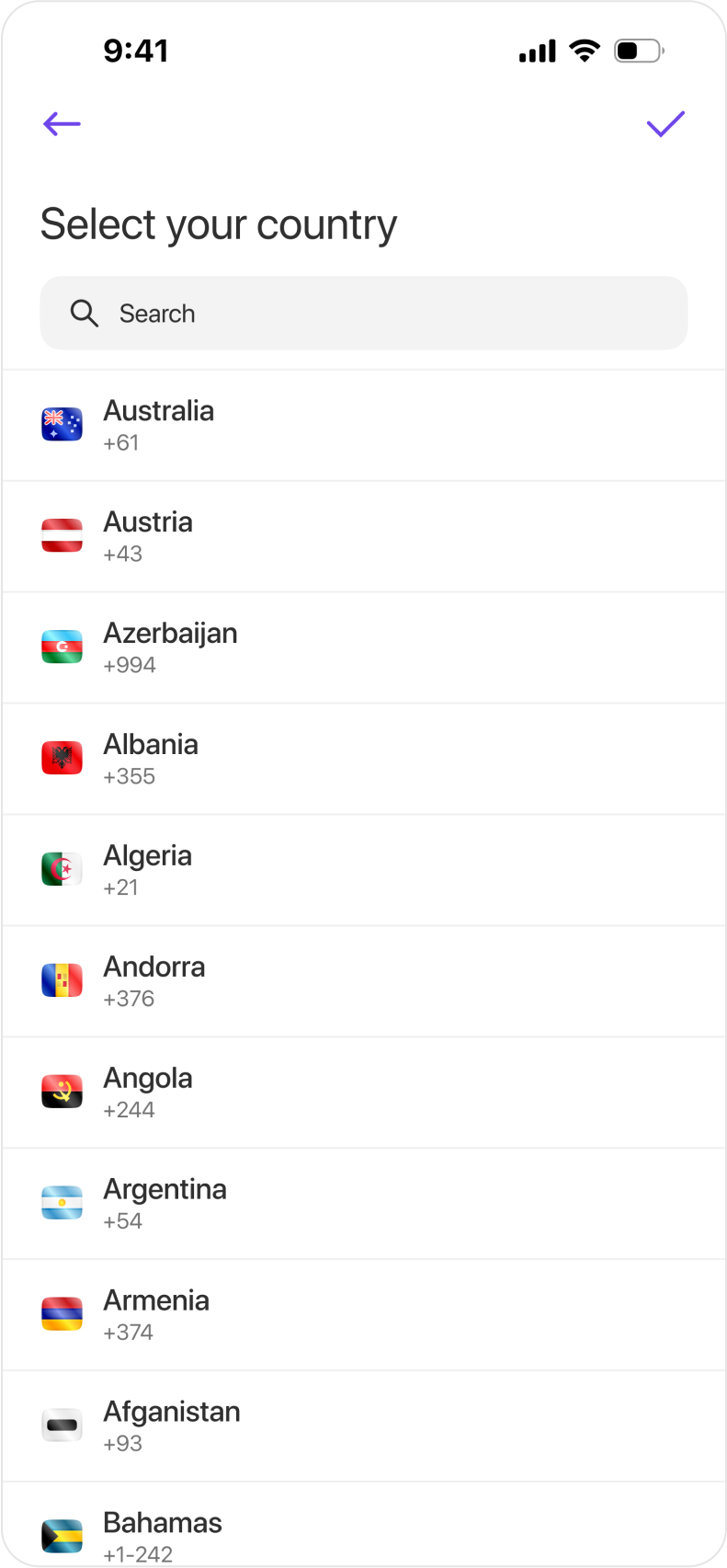
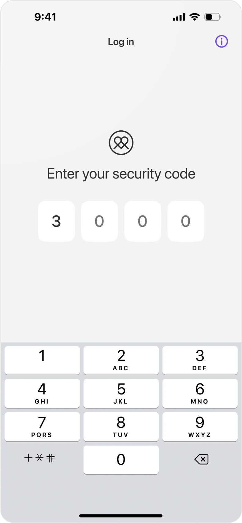
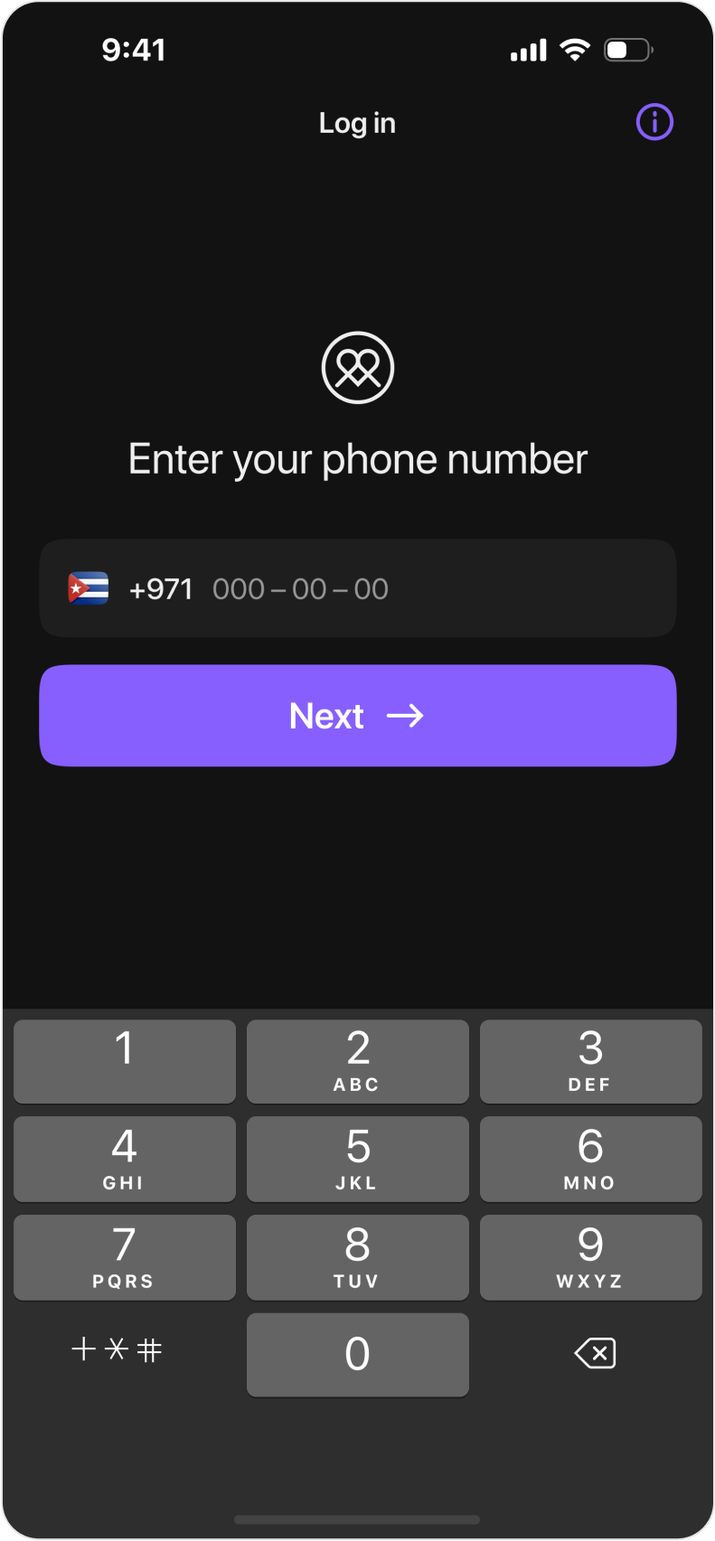
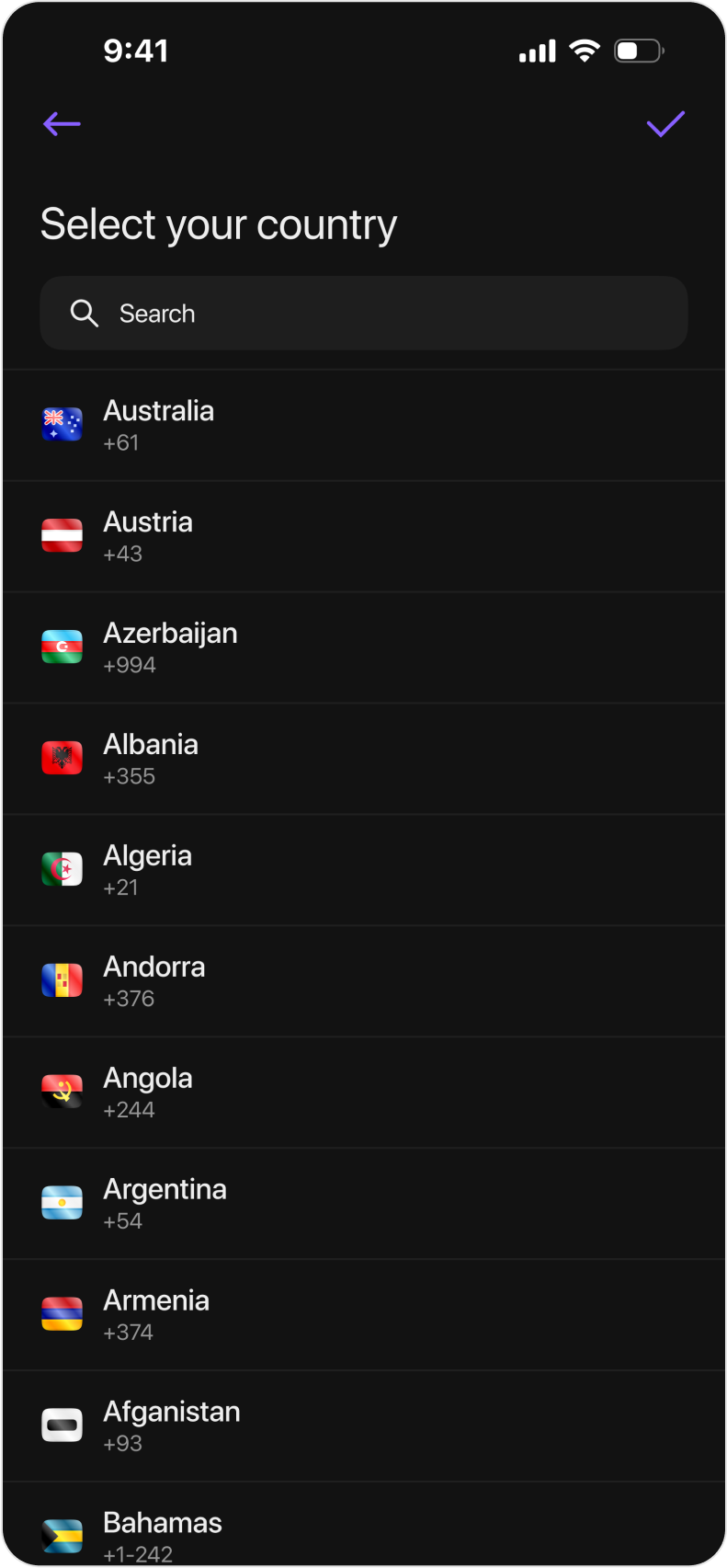
Quick registration via phone number. I personally designed the country flag icons and, based on them, prepared a full library of flags for all countries.
Main screen
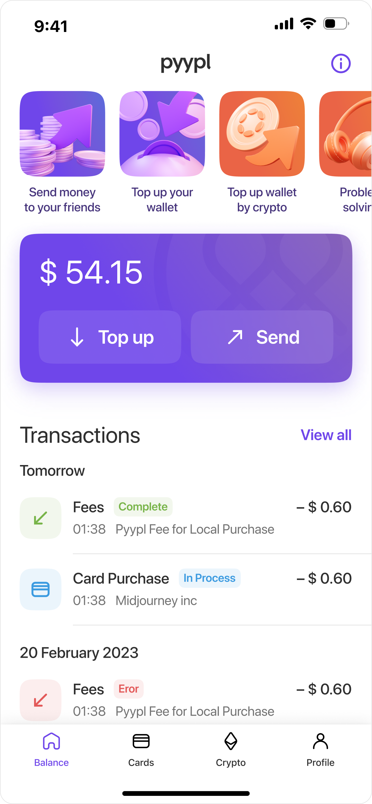
The app displays the user's balance, transaction history, and links to popular sections of information.
User Cards
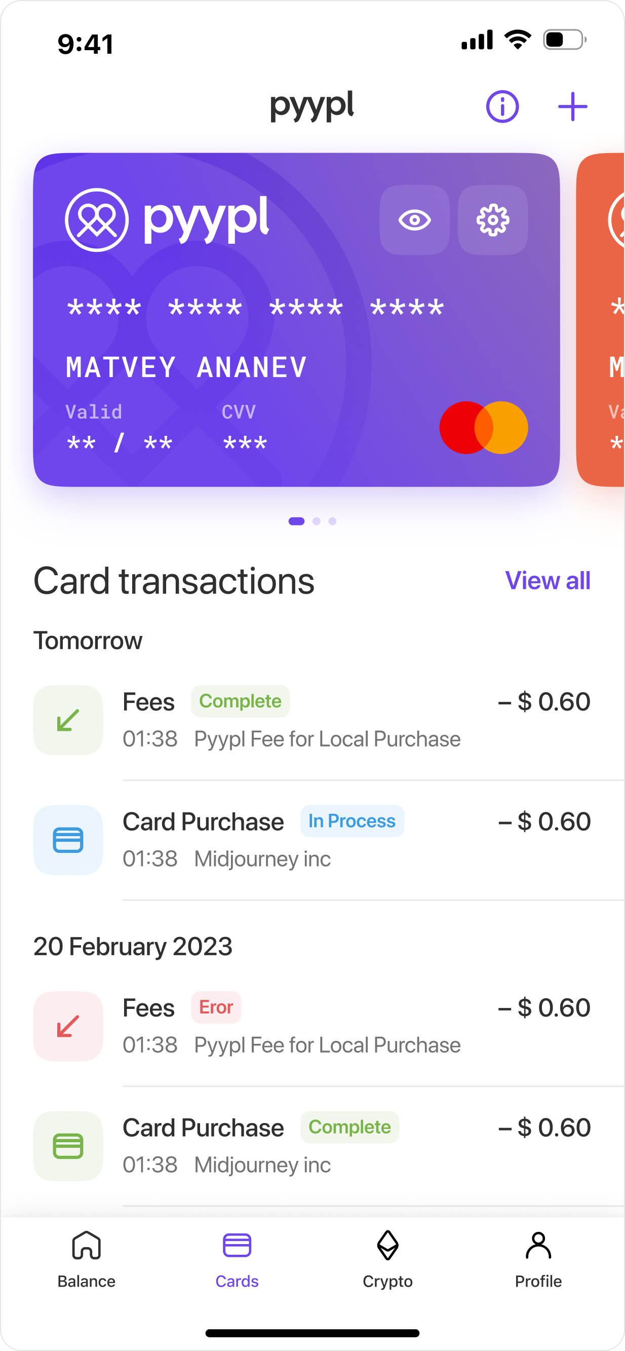
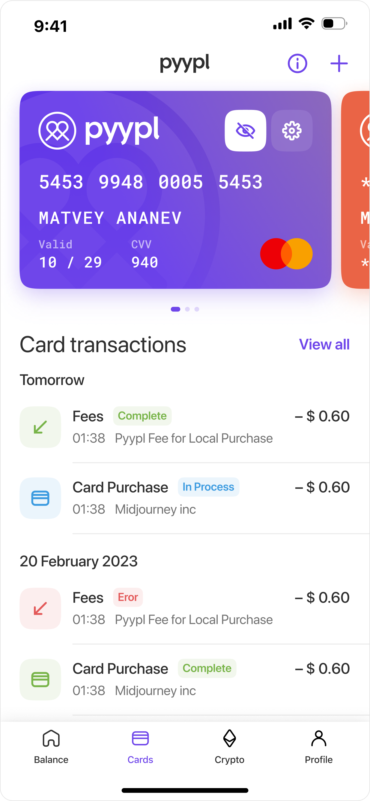
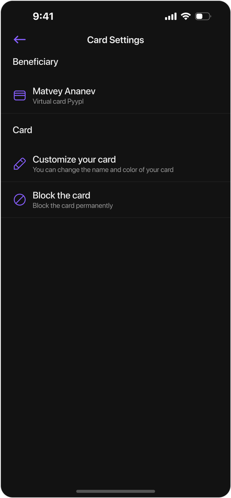
Card screen: users can swipe to select the desired card, view card details, customize the card, and check the transaction history.
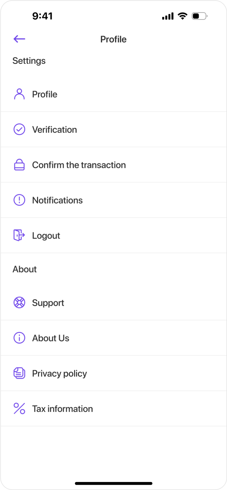
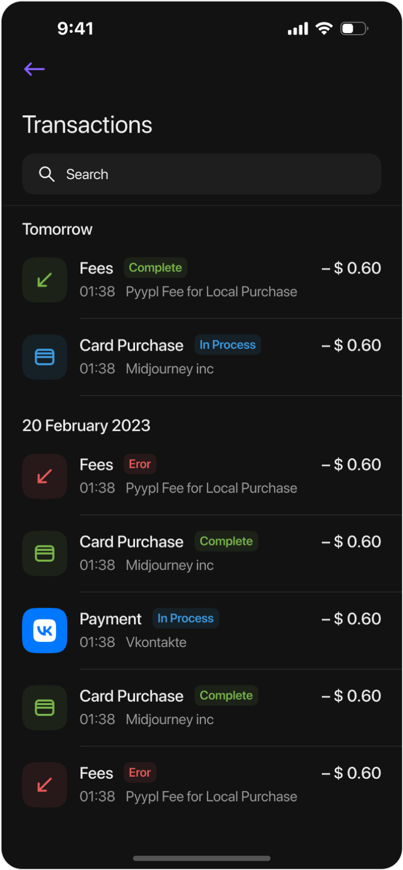
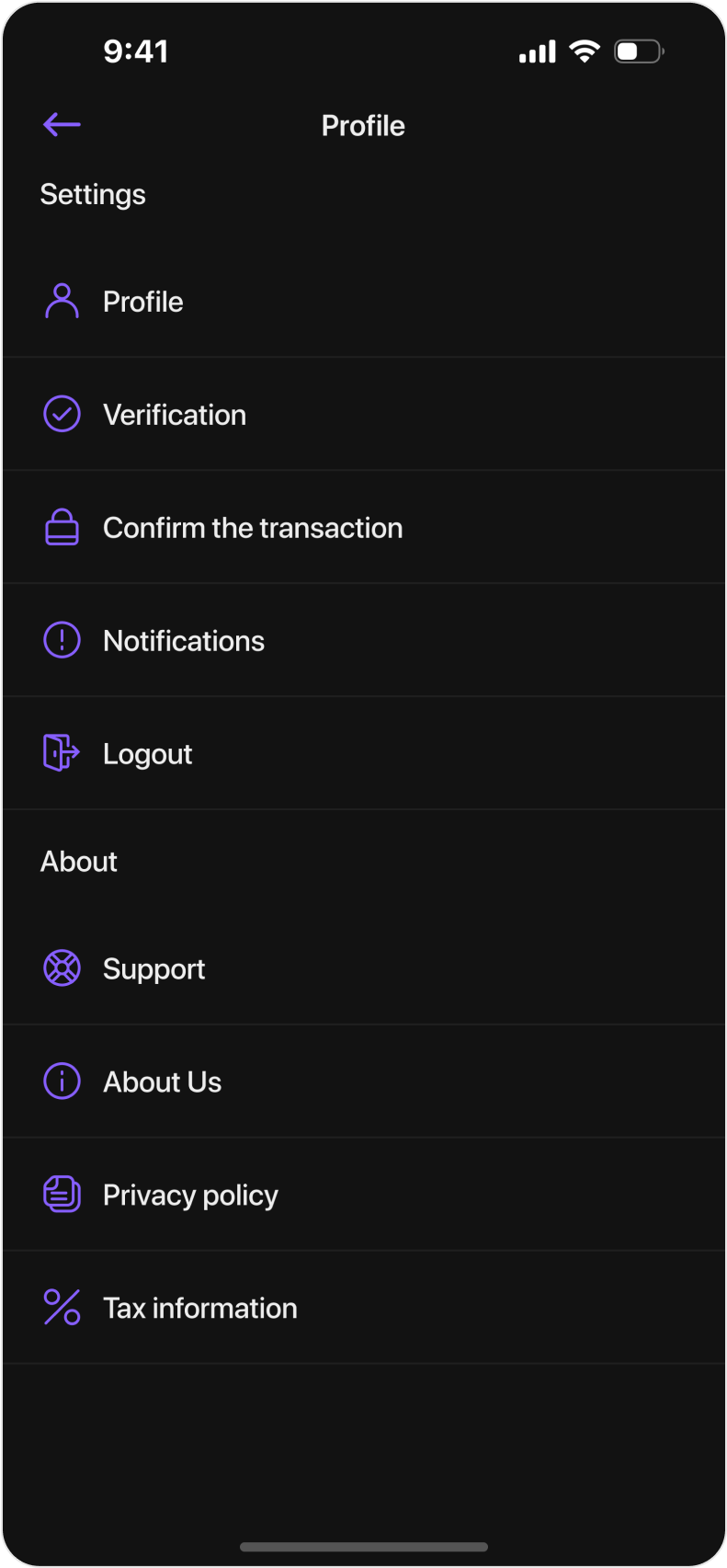
Transaction history, top-up and settings
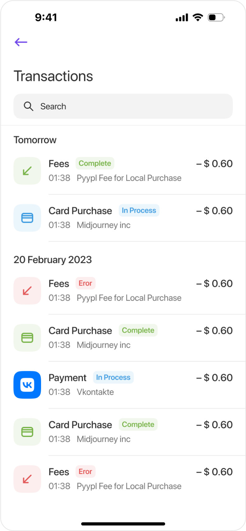
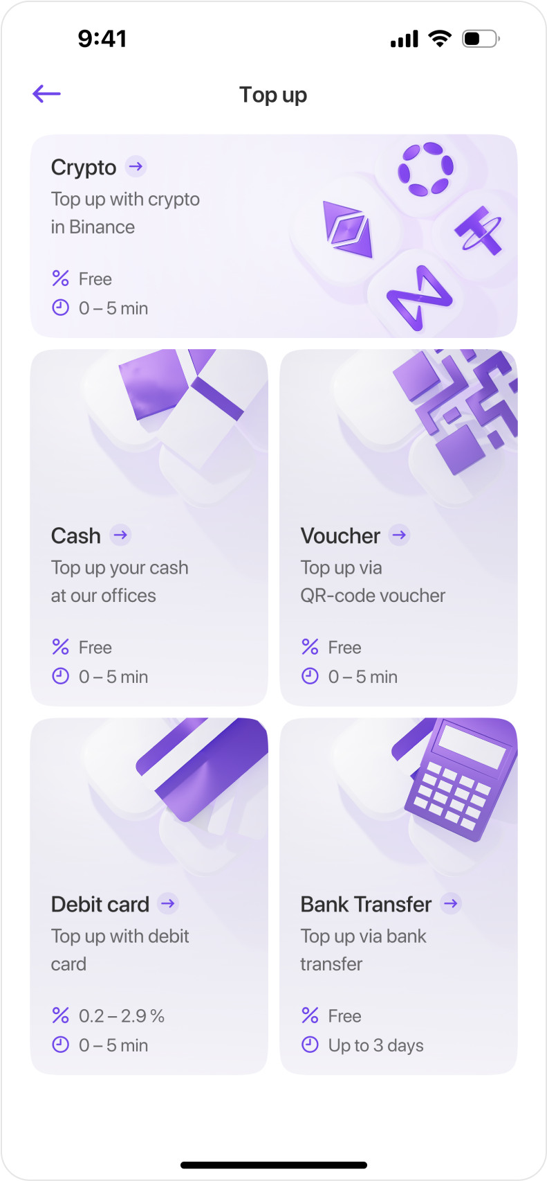
All user transactions are shown in the transaction history. The top-up screen displays available methods for replenishing the balance.
Contact me
Send me message from Telegram
 Write to Telegram
